
Simplifying User Navigation
With a redefined information architecture, its now easier for users to navigate and manage their settings efficiently and intuitively.

Overview
Role: Product Designer | Duration: 3 months (Jan - March 2023)
Collaborated with Product Designer Alex H, Product Manager Mike J, and Engineer Bressain D. to bring the project to life. Our work included competitive research, analyzing current usage, and conducting card sorting sessions with both customers and product experts. We iterated through low to high fidelity designs, gathered extensive feedback from internal stakeholders, and delivered final designs to engineering for implementation
Context
So what is Klaviyo? Who are we building for?
Klaviyo is a marketing platform that helps e-commerce brands connect with customers through email and SMS. It makes it easy to capture data, send personalized messages, and drive growth.

The problem
Users navigate multiple settings pages before leaving. The IA was also not scalable for future product features and releases. Some content is overly technical, and not all pages were built in React and/or follow the latest design system.
Why this matters?
These issues make it harder for users to complete tasks efficiently, impacting overall user experience and scalability.
Business goal
Improve the usability and scalability of Klaviyo’s settings to reduce support tickets, enable future product growth, and increase user efficiency and satisfaction.
Research
Users were clicking through an average of 2.7 pages, which led to a high number of support tickets.
We reviewed session replays in Heap to track how many pages users were navigating. Discussions with product experts revealed key usability issues that led to support tickets.
Card sorting exercise
We conducted card sorting exercises with both customers and product experts to capture perspectives from users and internal stakeholders.
User sessions
We not only watched session replays but also analyzed click data in Heap to see how many steps users took to reach their desired actions.
We laid out all the settings in FigJam and asked participants to organize them into categories that made sense, giving us insight into how people think about the settings. Some cards didn’t fit anywhere, which is expected in card sorting.
Analyzing research data
So what did we learn from this card sort?
-
Users tended to group settings by channel
-
Some items didn’t fit neatly into any category, which is common in this process
-
Security had mixed reactions. Half grouped it under Account, half treated it as its own group
-
Most users treated Billing as its own section, separate from Account

Solution
Redesigning Settings for Clarity and Scale
-
We restructured settings with a vertical tertiary navigation and a simplified, scalable IA to better support future growth.
-
The new experience was built entirely with Ascent components, ensuring consistency and faster performance.
-
We introduced autosave, applied intuitive patterns across content and configurations.
-
Began migrating features out of settings to create a clearer, more focused user experience.

Previously, the design used two stacked horizontal navigations, with one appearing beneath the other when a top level item was selected.

Design
Wireframing
The wireframes below explore a horizontal navigation and a vertical navigation.


Gathering more feedback
How did we align across teams?
We conducted a roadshow, which involved a major cross-functional effort. We met with every PM to gather feedback and secure approval, since these designs impacted multiple areas of the product. Originally, features like multi-factor authentication and single sign-on were under user roles, but feedback from the roadshow showed they belonged in their own section, Security.

Iterations
From wireframing to high-fidelity
As the project moved from wireframes to the design phase, engineering constraints surfaced, so we divided the releases into three phases.
Phase 1
Reorganization
Reorganized the settings structure without introducing visual or stylistic changes, focusing solely on moving items into more logical places. We also replaced the horizontal navigation with a vertical nav to improve clarity and usability.


Phase 2
Design system alignment
Previously, some settings were built with Ascent components and others were not. In this phase, we rebuilt everything using 100% Ascent components to create consistency, improve scalability, and align fully with Klaviyo’s design system.
Phase 3
Contextual enhancements
Introduced autosave and relocated certain settings into more contextual areas of the product, creating a smoother and more intuitive user experience. The mock on the right shows that we moved the back in stock feature to the products page, outside of settings, because it is more contextual and closely connected to the product.

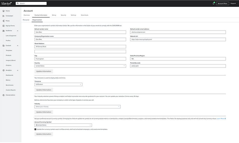
The final designs
The designs below highlight the importance of content writing and naming conventions. Its consistent across all tabs and settings so that if a new channel is added, its sub-tabs would follow the same naming structure. This makes it easier for users to quickly locate what they need.


Measuring success
Impact and results
Users clicked less within settings, indicating that finding and managing options became easier. At the same time, the number of support tickets decreased, showing that the updates helped reduce confusion and made the system more intuitive.
229
Unique accounts enabled Smart Opt-in
188K
Shoppers have opted in with Smart Opt-in
22%
lift with Smart Opt-in when compared to traditional opt-in
Reflection
This project was a big team effort with a lot of input from product managers and other stakeholders. Even after we went live, we kept iterating based on customer feedback and made adjustments to improve the experience. We also created a process for adding new settings so that anyone on the team could do it without relying on a single person for approval. Moving settings to the features they were connected to made it easier for users to find and use them. Overall, this project showed me how collaboration, clear documentation, and listening to feedback can make a product better and easier to manage.